
Sun / 24 January 2016
Pantone Color(s) in Home Décor
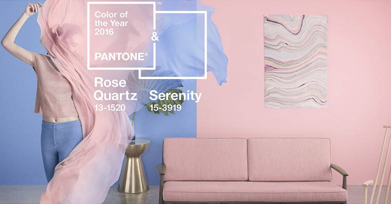
Leave Marsala in 2015 and say hello to a softer take on color for 2016. Every year the Pantone Color Institute nominates a Color of the Year, and for the first time Pantone introduces two shades, Rose Quartz and Serenity as the PANTONE Color of the Year 2016.
Pantone describes Rose Quartz as a persuasive yet gentle tone that conveys compassion and a sense of composure. Also, Serenity is weightless and airy, like the expanse of the blue sky above us, bringing feelings of respite and relaxation even in turbulent times.
The softness of these colors provides flexibility when decorating; not only can these two blissful colors be used on their own, they can also be used together within the same space to add luxury and refinement. Here are a few ways to introduce your Jasper space to Pantone 13-1520 TCX (Rose Quartz) and Pantone 14-3919-TCX (Serenity):
Accents: Start off small and infuse your space with Rose Quartz and Serenity. Whether its artwork, throw pillows, flowers or vases, you can easily incorporate these light shades of pink and blue. Add a few accessories in silver or hot brights for more splash and sparkle.
Living Area: These colors really do look great together, giving you the flexibility to go all out or try a more subtle approach. Swap out your sofa in a softer shade of this duo or add an accent chair in rose quartz. Add a splash of serenity with a geometric-print throw pillows. Throw a rug with an oversized print to the mix, it will add a whimsical touch to your space. The options are limitless.
Bedrooms: Serenity is the perfect color to use in bedrooms or other settings where a calm, serene effect is sought. The blue with a hint of soft purple evokes a soothing, tranquil feeling which is ideal for any space where you want a calming ambience. Create a clean, balanced look in the bedroom by adding a new comforter in one of these shades and pair it with neutrals like off-white or cool gray.
Kitchen: Combining rose quartz and gray will give your kitchen a relaxing, yet progressive, feeling. Pull your look together with pops of pink around the room by adding barstools, rugs, small appliances, fresh flowers and other accessories in these shades.
However you choose to integrate these hues into your space, they’re both beautifully pleasant shades that make great companions with each other or solo.
#RentJasper
Jasper is a convergence. Of structure and imagination. Of the classic and the eclectic. Of art and life. This 400-foot highrise crowns San Francisco’s fabled Rincon Hill and stands as an iconic addition to the city skyline. Residences from studios to three-bedrooms feature interior architectural design by Stanley Saitowitz and open to sweeping views of Downtown, SoMa and San Francisco Bay. It’s a statement about elegance in a place where elegance really means something. Be sure to follow Jasper on Facebook, Twitter, YouTube, Google+ and Instagram as we share news and updates about our exciting new community. #rentjasper It’s a heck of a place to call home.
Image credit: https://www.pantone.com/color-of-the-year-2016